What to Include on a Link-in-Bio Page (That Actually Converts)
It’s not about how many links you have. It’s about what happens when someone lands there.
Here’s what most people get wrong about link-in-bio pages:
They think “simple” means “basic.” So they throw up a plain white page with a few text links stacked vertically and call it done. Or they go the opposite direction — cramming in every possible link, adding animations, using five different colors, and wondering why nobody clicks anything.
Neither works.
A high-converting link-in-bio page looks simple. But behind that simplicity is intentional design — the kind that guides the eye, prioritizes action, and makes decisions feel easy. Simple and strategic are not the same thing.
Here’s exactly what belongs on a link-in-bio page that actually does its job.
The Real Purpose of a Link-in-Bio Page
Your link-in-bio page isn’t a directory. It’s a decision-making page — and the best ones make decisions feel effortless.
When someone lands there, they should know within two seconds: what you do, who you help, and where to go next. Anything that muddies those three things is working against you.
The nuance worth noting: you can have multiple links — as long as they’re strategically prioritized. The difference between a cluttered link-in-bio and a converting one isn’t how many links you have. It’s how clearly one of them is the obvious next step.
What to Include (And How to Structure It)
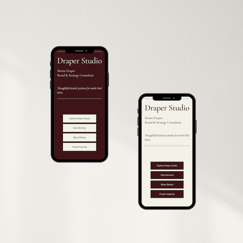
1. A clear visual hierarchy
Not all links are created equal — and your page shouldn’t treat them like they are.
Your primary CTA should be visually dominant: bigger button, bolder color, positioned at the top. Your supporting links can exist, but they shouldn’t compete for attention. Most DIY link-in-bio pages fail here. Everything is the same size, the same weight, the same visual priority. And when everything fights for attention, nothing gets clicked.
Good design makes the choice obvious. The visitor shouldn’t have to decide what’s most important — the page should tell them.
2. One primary action
This is the single thing that moves the needle for your business right now. It could be your lead magnet if you’re building your list, your booking page if you’re taking on clients, or your shop if you’re selling products.
If someone only clicks one thing on your page, this should be it. Design it accordingly.
3. One or two supporting links
These add context without overwhelming. Think: your About page so they can get to know you, your services or portfolio so they can see your work, or a secondary offer if you have multiple revenue streams.
The key distinction: these links should support your primary action, not compete with it. If your main CTA is “Download my free guide,” a secondary link might be “Learn more about working with me.” One pulls them in. The other gives depth.
4. A rotating promo spot (optional but worth having)
This is your “right now” link — a limited-time offer, a new product launch, a current event or workshop. The important thing: rotate it out when it’s no longer relevant. An outdated promo sitting on your page quietly signals that no one’s home.
5. Strategic white space
White space isn’t empty space. It’s the thing that makes a page feel calm instead of chaotic. It separates sections, draws the eye to what matters, and prevents the visual overwhelm that makes people bounce.
Most people pack everything tight because they’re afraid of “wasted” space. But that’s exactly what makes a page feel cluttered. Good design knows when to hold back.
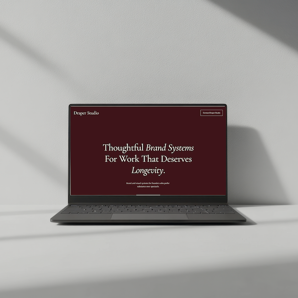
One-Page Website + Link-In-Bio Template
The Refined + Golden one-page website and link-in-bio template is built around this exact structure — intentional hierarchy, strategic white space, one dominant CTA. You can keep it minimal or scale it up for multiple offers. Either way, it’s pre-built to convert.
What to Skip (Even If You’re Tempted)
Multiple CTAs with equal visual weight. If everything is screaming for attention, nothing gets clicked. One primary action. Always.
Long paragraphs of explanation. No one is reading three sentences on a link-in-bio page. If you need to explain it, the offer isn’t clear enough yet.
Social media icons at the top. If someone landed on your page, they probably came from social media. Don’t send them back. Keep them moving forward.
Design that “looks fine” but isn’t strategic. Slightly misaligned buttons, fonts that don’t quite work together, spacing that’s just a little off — it’s not bad, but it’s not earning trust either. And trust is what converts.
Why “Keep It Simple” Advice Doesn’t Always Work
Here’s the hard truth: you can follow all the right advice and still end up with a page that doesn’t convert.
Because advice like “use white space” and “prioritize your CTA” only works if you know how to execute it. Where exactly does the white space go? How much is enough? Which button should be bigger and by how much? What font pairing communicates calm and professional without feeling cold?
These are design decisions that require experience — or a template built by someone who already made those decisions for you.
A well-designed template isn’t just pretty. It’s pre-optimized. The visual hierarchy is already built in. The white space is already placed. The font pairings are already tested. You’re not starting from scratch — you’re starting from a framework that already works, and customizing it to fit your brand.
That’s the difference between spending three hours trying to make something “look right” and spending twenty minutes plugging in your content and hitting publish.
Quick Audit: Is Your Link-in-Bio Page Converting or Just Existing?
Run through these four questions:
✅ Can someone land on this page and know immediately what to do?
✅ Is there one action that’s visually prioritized above everything else?
✅ Does the page feel calm and intentional, or cluttered and chaotic?
✅ Would a stranger understand your offer in five seconds or less?
If you answered no to any of these, the issue isn’t your offer. It’s the design. And design is fixable.
One-Page Website + Link-In-Bio Template
The Refined + Golden link-in-bio template is designed with this framework built in — so you’re not guessing at hierarchy or wrestling with spacing. Keep it minimal with one or two links, or build it out to showcase multiple offers. Pre-built to work from day one.
Your Link-in-Bio Page Is Working For You or Against You.
There’s No In Between.
People make snap decisions. If your page looks cluttered, they assume your business is cluttered. If it feels overwhelming, they leave.
But if it’s clean, clear, and visually prioritized? They click. They move forward. They come back.
That’s not magic. That’s strategic design — and it’s completely within reach.
Here’s where to go next:
Browse the Refined + Golden template shop — link-in-bio and one-page website templates built for clarity and conversion.
Explore custom web design — if you’re ready for a fully custom presence beyond a single page.
Grab the free Brand Clarity Guide — because a converting link-in-bio page starts with knowing exactly what you’re pointing people toward.
One clear page. One obvious next step. That’s all it takes.