Why Most Canva Templates Overwhelm Solopreneurs (And What to Look for Instead)
The template was supposed to save you time. Here’s why it didn’t — and what a good one actually looks like.
You bought the Canva template because it looked perfect.
The sales page said it was easy to customize and beginner-friendly. The preview screenshots were gorgeous. So you downloaded it, opened it, and immediately felt overwhelmed.
Fifty slides. Twelve font pairings. Seventeen layout styles. Elements layered on top of elements. You sat there thinking: I thought this was supposed to make things easier.
Here’s the thing: Canva templates aren’t inherently bad. But most of them are designed for quantity and visual impact — not for the solopreneur who just needs to get something done. And that’s a real problem.
Why Most Canva Templates Are Built the Wrong Way
There are three things most template creators optimize for. None of them are usability.
Visual novelty. Templates are designed to look impressive in a mockup — lots of decorative layers, trendy gradients, overlapping shapes. But when you actually try to edit it? You’re spending 20 minutes hunting for the right layer just to change a word.
Trend cycles. Templates built around whatever is trending right now look dated in six months. You’re not buying a tool. You’re buying a moment in time.
Perceived value through page count. “100+ slides!” “50 layout options!” More pages — in theory — feel like a better deal. But more choices don’t make things easier. They make them harder. Most people pick two or three layouts they like and ignore the other 97. The rest is just clutter.
When templates are built for visual impact instead of usability, what gets sacrificed is the whole point:
❌ Ease of use — you shouldn’t need a tutorial just to change the text color
❌ Clear hierarchy — when every element competes for attention, nothing stands out
❌ Real-world application — a template that takes an hour to customize isn’t saving you time
❌ Longevity — design built around trends looks dated before you’ve gotten your money’s worth
You thought you were buying a shortcut. Instead, you’re wrestling with locked layers and wondering why the whole layout breaks when you move one text box.
What Solopreneurs Actually Need From a Template
When you strip away the noise, here’s what a template should do for you:
Reduce decisions, not multiply them. You don’t need 50 layout options. You need five good ones that cover 90% of what you’ll ever create. Less scrolling, less second-guessing, less “which one should I use?”
Support your content, not compete with it. The design is the container. Your message is the priority. If the design is louder than what you’re actually saying, the template isn’t doing its job.
Feel calm to open and edit. You should be able to open the file, plug in your content, and be done in 20 minutes. No surprise locked elements. No mystery layers. No chaos when you delete one shape.
Work quietly in the background. Good design doesn’t announce itself. The best templates are the ones your audience doesn’t notice — because they’re too focused on what you’re saying.
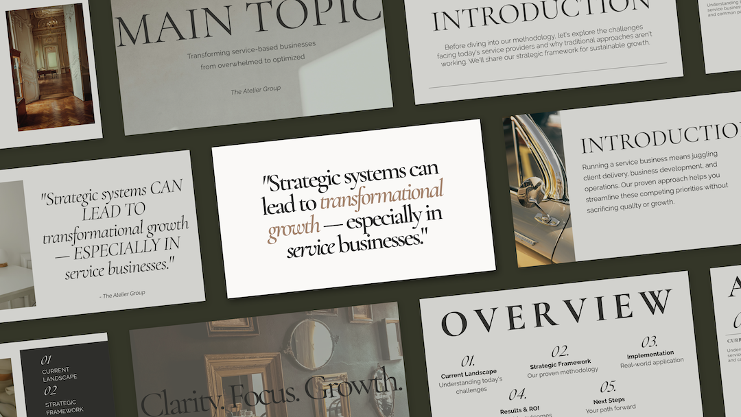
This is the philosophy behind the Refined + Golden template collection: fewer layouts, stronger structure. Instead of 100+ variations with no clear use case, you get a focused set of layouts — each with a purpose — and a real example showing how they work together. No guessing. No overwhelm.
How to Tell a Good Template from a Frustrating One
Before you buy another Canva template, run it through this quick filter:
Red flags to watch for:
🚩 Dozens of layout variations with no clear use case. If you can’t immediately tell when you’d use each one, that’s a problem.
🚩 Heavy reliance on trendy design elements. Gradients, neon, maximalist layouts — ask yourself: will this look professional in a year?
🚩 Complex layering with no explanation. If you open the file and can’t figure out how to edit text without breaking things, that’s time you’re losing.
🚩 “Endless customization!” with no guidance. Customization is only useful if there’s a clear starting point.
Green lights to look for:
✅ Clear use cases for each layout. You know immediately when to use each one.
✅ Cohesive design throughout. Every layout feels like part of the same intentional system.
✅ Simple, editable structure. Minimal layers, clean hierarchy, no locked surprises.
✅ Timeless design choices. Classic fonts, clean spacing, versatile palettes. Something still professional next year.
✅ A philosophy behind the design. The best template creators are solving a specific problem — not just making something that looks good on a sales page.
Quick Audit: Is Your Current Template Working for You?
If you already have Canva templates you’re not using, ask yourself:
✔️ Can I open this file and customize it in under 30 minutes?
✔️ Do I actually use most of the layouts, or do I ignore 80% of them?
✔️ Does the design support my content, or compete with it?
✔️ Will this still look professional in 6–12 months, or does it already feel dated?
If you answered no to any of these, your template is working against you. And you deserve one that doesn’t.
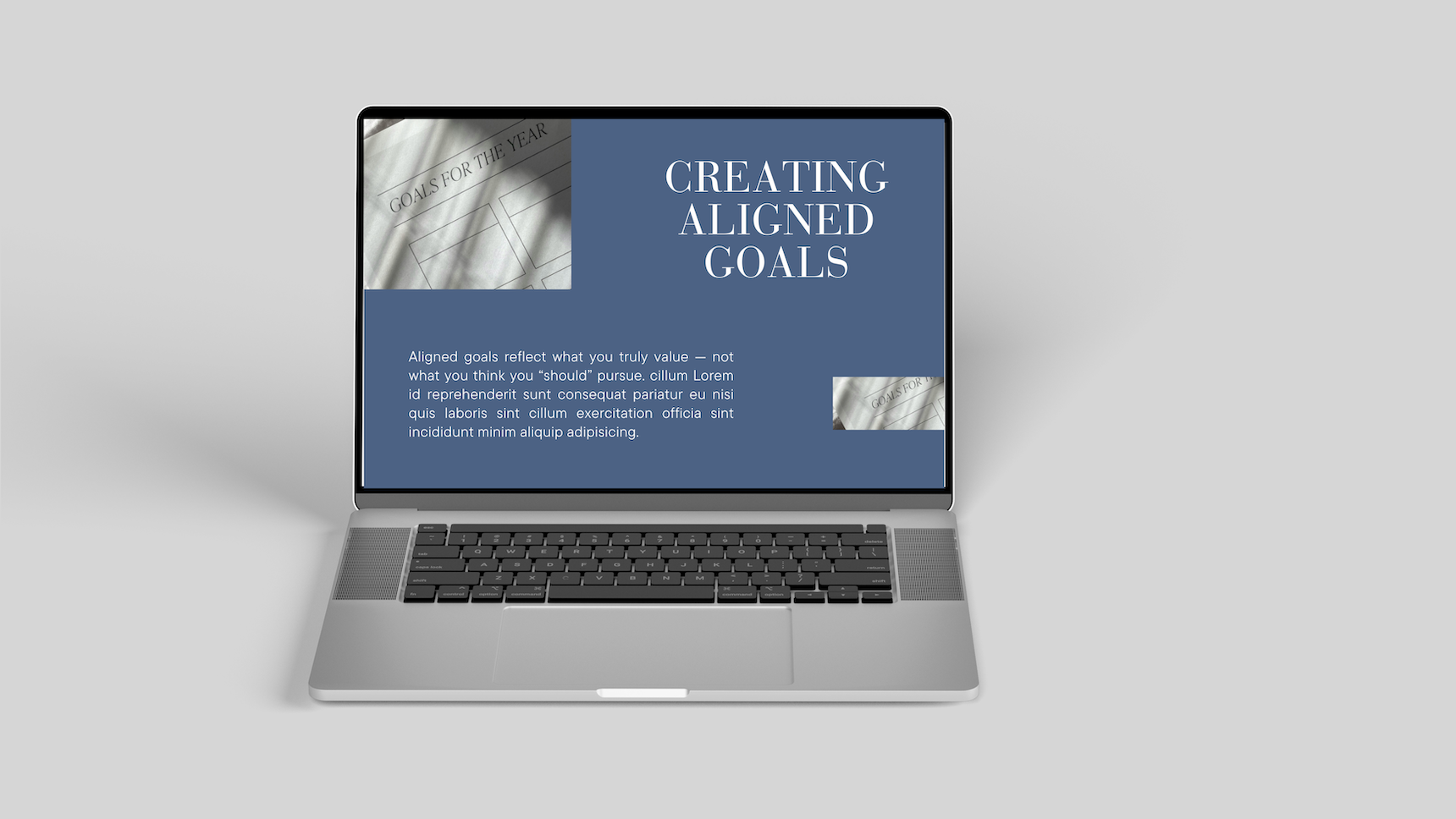
The Refined + Golden template collection is built around reuse, clarity, and longevity — not trends. Fewer layouts. Stronger structure. Designed for real solopreneurs and service providers who need something that actually works when they open it.
Templates Should Feel Like Relief, Not More Work
You didn’t start your business to become a Canva expert. You started it to serve your clients, sell your products, share your expertise — whatever your thing is.
Templates are supposed to support that work. The right one should feel like someone handed you a system that just works, so you can get back to the part that actually matters.
That’s the difference between a template designed for Pinterest screenshots and one designed for real business owners who need to get things done.
Here’s where to go next:
Browse the Refined + Golden template shop — Canva templates built for clarity, usability, and longevity.
Explore custom web design services — if you’re beyond templates and ready for something built specifically for your business.
Grab the free Brand Clarity Guide — because the best template in the world won’t help if the message behind it isn’t clear. Start there.
The right tools should make your work easier, not harder. You deserve both.