How to Build a High-Converting Landing Page for Your Solopreneur Business
Most landing pages fail because they’re doing too much. Here’s how to build one that converts without the countdown timers, the hype, or the chaos.
I’ve spent a lot of time scrolling landing pages that feel like they’re yelling at me.
Flashing countdown timers. Seventeen testimonials stacked in a row. Three competing calls-to-action. A color scheme that suggests someone discovered the highlighter tool and never looked back.
And then the creator wonders why no one’s converting. Here’s the truth: most landing pages don’t fail because the offer is bad. They fail because the page is doing too much.
Too many sections. Too many fonts. Too much urgency. Too many decisions. For solopreneurs — especially those building service-based or personal brands — clarity converts better than hype every single time.
A calm landing page doesn’t mean boring. It means intentional. Here’s the framework.
What a Calm Landing Page Actually Means
A calm landing page has one clear goal, guides the eye naturally, uses white space strategically, and feels confident rather than desperate.
When someone lands on it, they should immediately know three things: what this is, who it’s for, and what to do next. Anything beyond that is optional.
And yet most landing pages act like they’re trying to teach a masterclass, close a sale, collect emails, and sell you a vacation package — all at once.
Pick one goal. Build toward it. Let everything else go.
Who This Framework Is (And Isn’t) For
Let’s be clear about what we’re building here.
This framework is not for flash sale pages that depend on urgency and FOMO, high-ticket webinar funnels with 90-minute replay videos, or anyone whose strategy involves aggressive pressure tactics.
This is for service providers who want to build trust instead of hype, solopreneurs selling digital products, templates, or lead magnets, and anyone who’s tired of landing pages that feel like a used car lot.
If you’re nodding — keep reading.
The 5-Part Calm Landing Page Framework
Part 1: A Clear, Grounded Headline
Not clever. Not cryptic. Just clear.
Your visitor should understand the value in one read — no detective work required. The headline isn’t the place to be poetic. It’s the place to be unmistakable.
✕ “Unlock Your Full Potential with Our Revolutionary System”
✓ “A 5-Page Website Template for Coaches Who Hate Tech”
See the difference? One makes you guess. The other tells you exactly what you’re getting and who it’s for. Your headline does that job or it doesn’t. There’s no in between.
Part 2: One Sentence of Gentle Reinforcement
One short paragraph that explains why this matters — not your life story, not every credential you’ve earned, not a wall of text justifying your expertise.
You don’t need to convince anyone you’re qualified. You need one sentence that says: I get it, and I can help.
“You don’t need a complicated website. You need one that works — without the tech headache or the $5K price tag.”
That’s it. One sentence. No dissertation required.
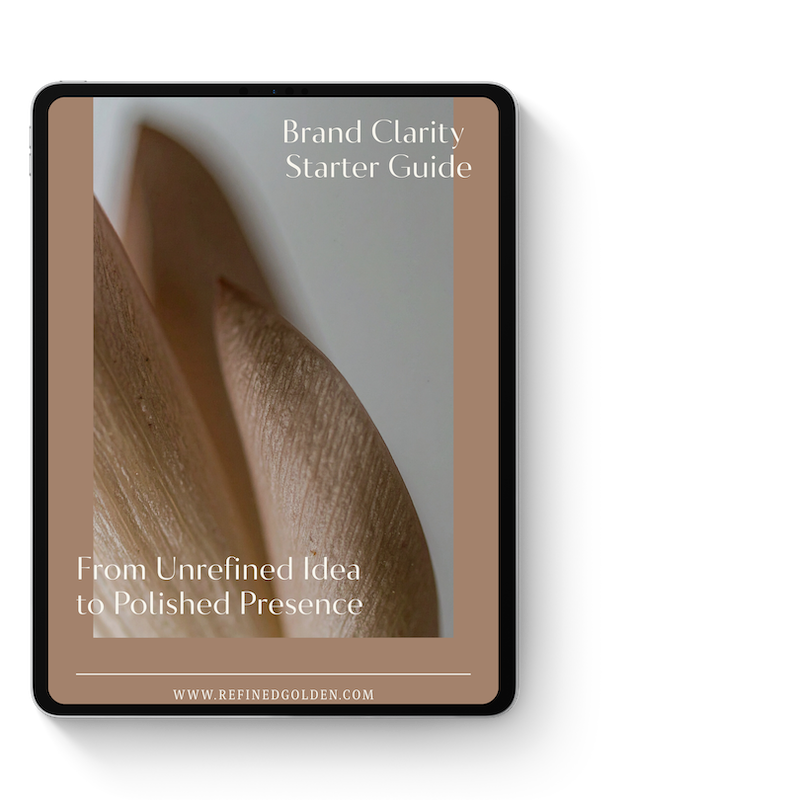
Clarify Your Brand Message
Before Writing Your Website
Before you write a single word of your landing page, you need to know exactly who you help and what you’re offering. The free Brand Clarity Guide walks you through the framework I use with every client — so your headline lands and your reinforcement line actually reinforces something.
Part 3: A Simple Breakdown of What They’ll Get
Bullets over paragraphs. Specific over vague. Always.
Your visitor isn’t trying to decode your offer. They’re deciding if it’s right for them. Make that decision as easy as possible.
✕ “You’ll get everything you need to succeed online.”
✓ Three to five specific, concrete bullets that describe exactly what’s included.
For example:
5 pre-designed page layouts (Home, About, Services, Contact, Blog)
Drag-and-drop Canva files — no design experience needed
Setup guide with step-by-step instructions
Specific beats vague every time. Tell them exactly what’s in the box.
Part 4: A Calm Call-to-Action
You’re not trying to trick someone into clicking. You’re inviting them to take the next logical step. That distinction matters — both in how you write the CTA and how it feels to read it.
✕ “DON’T MISS OUT — GRAB YOURS NOW BEFORE IT’S GONE FOREVER!!!”
✓ “Download the template.” “Get started.” “Book a call.”
Simple, direct, and confident language outperforms desperate urgency when trust is the goal. “Download,” “Get access,” and “Start here” all do the job without the noise.
One CTA. Positioned clearly. Repeated at the bottom if the page is long. That’s it.
Part 5: A Clean Footer Close
No surprise sections. No last-minute panic selling. No “Wait! One more thing!”
If someone has scrolled to the bottom and hasn’t converted yet, another testimonial carousel isn’t going to change their mind. Let the page end with confidence.
You’ve made your case. Made it clearly. Made it calmly. Now let them decide.
Quick Audit: Is Your Landing Page Calm or Chaotic?
Run your current page through these four questions:
Can someone explain your offer in one sentence after reading your headline?
Is there only one clear action to take on the entire page?
Could you remove a section and the page would still work?
Does the page feel like a breath of fresh air — or a battle to get through?
If you answered no to any of these, your page is probably doing too much. The fix is almost always subtraction, not addition.
Why This Works (Especially for Solopreneurs)
Your audience is already overwhelmed. They’re juggling work, life, decision fatigue, and 47 open browser tabs. Your landing page doesn’t need to add to the noise. It needs to be the one thing that finally makes sense.
A landing page that feels calm communicates confidence. And confidence converts.
You’re not begging. You’re not convincing. You’re just clearly presenting something valuable and letting them decide. That’s the whole strategy.
The solopreneurs who convert consistently aren’t the ones with the loudest pages. They’re the ones whose pages feel the most certain — like the offer is so clear and so right that the only logical move is to click.
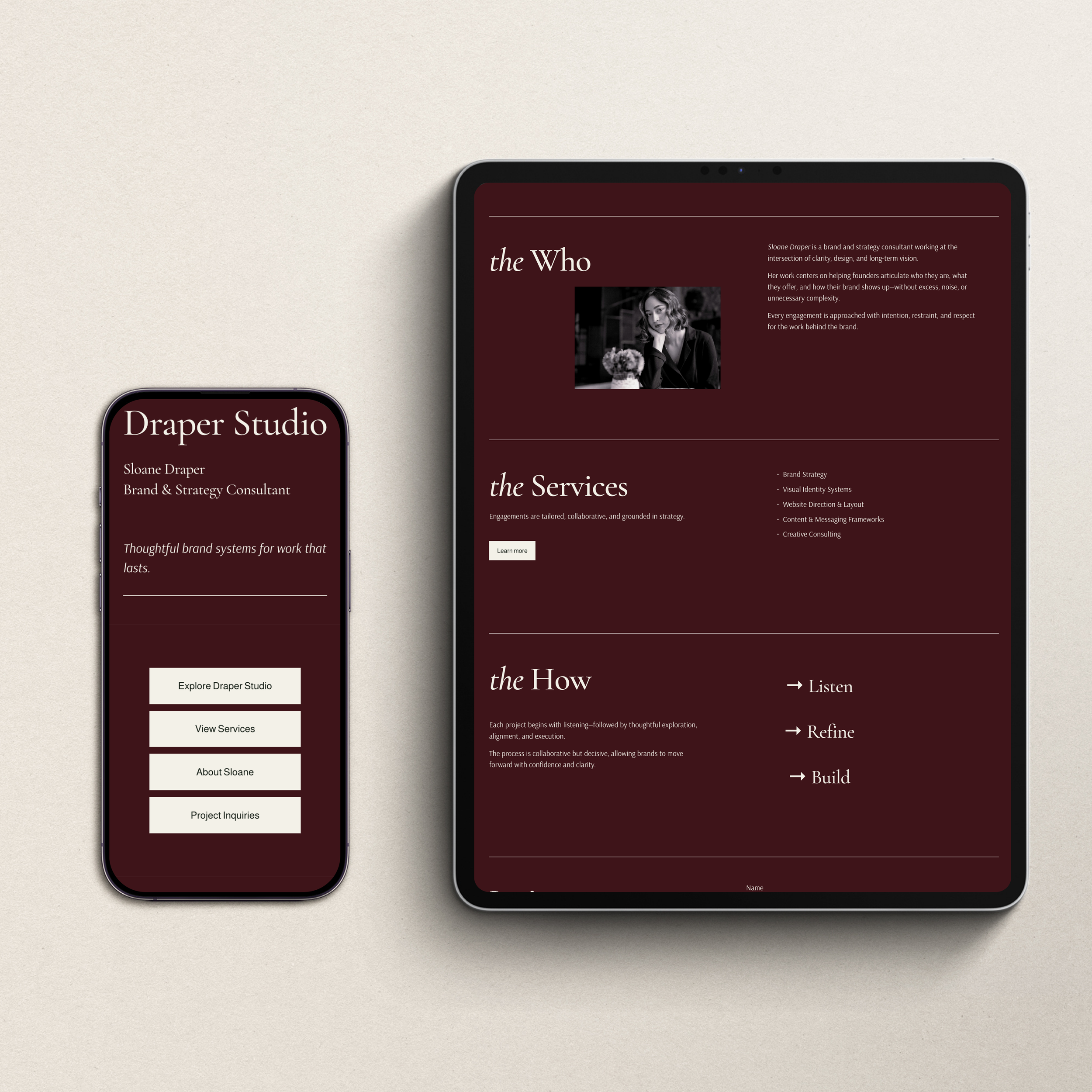
One-Page Website + Link-In-Bio Template
If you want a landing page layout that already follows this framework — clear headline, intentional hierarchy, one calm CTA — the Refined + Golden Landing Page and Link-in-Bio Canva Template is pre-built for exactly this. No starting from scratch. No designer required.
Clarity Is the Strategy. Calm Is the Execution.
You don’t need urgency tactics. You don’t need seventeen testimonials. You don’t need a page that tries to do everything at once.
You need a page that knows what it’s for, says it clearly, and makes the next step feel obvious. Five parts. One goal. That’s the whole framework.
Here’s where to go next:
Grab the free Brand Clarity Guide — start with a clear message before you build anything.
Browse the Refined + Golden template shop — landing page and website templates built around this exact framework.
Book a custom design consultation — if you’re ready for a fully custom landing page or website built specifically for your business.
One clear goal. Five intentional parts. A page that finally works the way you need it to.
-
A Canva template gives you a professionally designed starting point you can customize yourself — ideal if you're early-stage or working with a limited budget. A custom web design project means a designer builds everything for you with your specific brand, audience, and goals in mind. Many solopreneurs start with templates and upgrade to a full custom site as their business grows.