Website Audit Checklist for Solopreneurs: 8 Things to Review Before You Lose Clients
Most websites aren’t broken. They’re just quietly underperforming. Here’s how to find out which one yours is.
Your website is your digital storefront. And just like a physical space, it needs regular attention — not a full renovation every year, but an honest look at what’s working and what’s quietly getting in the way.
If it’s been more than six months since you’ve looked at your site through a stranger’s eyes, this is your sign.
Outdated content. Slow load times. A homepage that takes too long to get to the point. A contact page that doesn’t tell anyone what happens next. These things don’t announce themselves — they just slowly chip away at your conversion rate while you’re busy doing everything else.
The good news: most website issues are easy to fix once you know what to look for. This 8-point checklist will tell you exactly where to look.
The 8-Point Website Audit Checklist
1. Does your homepage pass the 5-second test?
When someone lands on your homepage, you have roughly five seconds before they decide to stay or leave. In that window, they need to understand who you help, what you do, and why it matters. Open your homepage right now and read only the first three lines. Does it answer those questions clearly? If you’re too close to your own business to tell — that’s a signal worth paying attention to.
2. Is your unique value proposition above the fold?
Your value proposition isn’t just what you do — it’s why someone should choose you. It should name the transformation you offer, not just the service. “I help solopreneurs build websites that convert” is a value proposition. “Web design services” is a category. One earns attention. The other gets scrolled past.
3. Does every page have a clear next step?
Every single page on your site should guide a visitor toward something. Not three things — one thing. Whether that’s booking a call, visiting the shop, downloading the Brand Clarity Guide, or reading a related post. Without a clear CTA, even genuinely interested visitors leave without acting — not because they don’t want to, but because you didn’t tell them what to do next.
4. Is your site actually usable on mobile?
Over half of all web traffic comes from mobile devices. Pull up your website on your phone right now — not in a desktop preview, on your actual phone. Is the text readable without pinching? Do the buttons have enough space to tap? Does the navigation make sense? If the answer to any of these is “not really,” your mobile visitors are quietly leaving.
5. Does your site load in under 3 seconds?
For every extra second it takes your site to load, you lose a measurable percentage of visitors. Large, unoptimized images are the most common culprit — and the easiest fix. Run your URL through Google PageSpeed Insights (free) and look at what it flags. You might be surprised what’s slowing you down.
6. Can someone find your contact information without searching for it?
This one seems obvious. It’s not always obvious in practice. Your contact details — or at minimum a clear CTA button pointing to your contact page — should be visible in your navigation, your footer, and on your services page. If a potential client has to hunt for how to reach you, many of them simply won’t.
7. Does your copy speak to your client’s problems — not just your services?
There’s a difference between a website that describes what you do and a website that speaks directly to what your client is experiencing. The first lists services. The second names the specific frustration, the specific desire, the specific outcome your client is hoping for. The second one converts. Read your homepage copy out loud. Is it about you — or about them?
8. Is your brand visually consistent across every page?
Consistency creates trust. Not perfection — consistency. The same fonts, the same color palette, the same general tone and feel across every page. When something looks off — a mismatched template, a different font on the blog, a photo style that doesn’t match the rest — it creates a subtle sense of unease that most visitors couldn’t name but definitely feel.
Clarify Your Brand Message
Before Writing Your Website
Before you rewrite a single word of your website, get clear on what you’re actually trying to say.
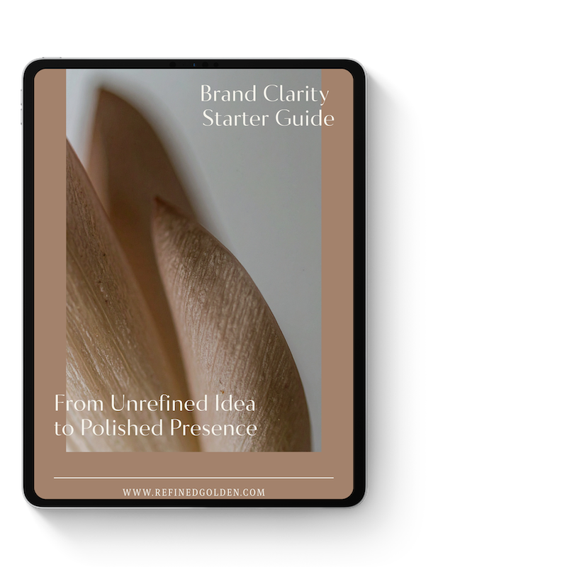
The free Brand Clarity Guide walks you through the framework I use with every client — who you help, what you offer, and how to communicate it in a way that lands.
How Did Your Site Score?
Go back through the eight points and tally your honest answers.
7–8 ✓ Your site is in good shape. Focus on keeping content current and watch your analytics.
4–6 ✓ Some meaningful gaps. Prioritize the ones touching your homepage and CTA first — they’ll have the fastest impact.
0–3 ✓ Your site may be actively costing you clients. The fixes are closer than you think — but it’s worth getting strategic about where to start.
Fewer than 6? Don’t panic. Most of these are simpler to fix than they seem. Sometimes it’s one rewritten headline. Sometimes it’s moving a button. The audit is the hardest part — and you just did it.
3 Website Trends Worth Paying Attention To
These aren’t trends to chase — they’re directional signals worth being aware of as you make updates.
Strategic minimalism — Clean, focused designs are consistently outperforming cluttered ones. Every element on the page should earn its place. If it’s not guiding someone toward a decision, it’s probably getting in the way.
Authentic brand storytelling — Clients connect with the person behind the business. The more your website sounds like you — specific, warm, real — the more it builds the kind of trust that turns visitors into inquiries.
Intentional user pathways — The best-converting websites guide visitors through a deliberate sequence: understand the offer → see the proof → take the next step. Every page should know where it’s sending people and why.
One-Page Website + Link-In-Bio Template
If you want a website layout that already follows this exact framework — clear value proposition, mobile-ready, with intentional user pathways built in — the Refined + Golden Squarespace website templates are pre-built and ready to customize. No starting from scratch. No designer required.
Ready to Do More Than Audit?
An audit tells you what’s not working. What you do next determines whether anything changes.
Here’s where to go from here:
Download the free Website Refresh Checklist PDF — all 8 audit points in a printable format you can work through at your own pace.
Browse the template shop — if your site needs a visual overhaul and you want a polished starting point without the custom price tag.
Book a website audit or discovery call — if you’d rather have someone who does this every day tell you exactly what to fix and in what order.
Grab the free Brand Clarity Guide — the foundation for any website refresh worth doing.
Your website is one of the hardest-working tools in your business. It deserves the same attention you give everything else.